D E S I G N | from sketch to a digital product by doing and reading.

Mindsets
Theories
Practices
CMD Methods Pack Designkit Methods Pack Design Method Toolkit for agile Free, online courses for digital, creative professionals. Learn UX Design
De verschillen tussen UX- en UI-design
Design | Realisation
UX-design en UI-design zijn twee termen die vaak voor hetzelfde worden gebruikt, maar andere betekenissen hebben. Wat is het verschil tussen UX en UI? Dat leggen zij uit.

The Grid System: Building a Solid Design Layout
Design | Realisation
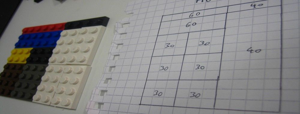
The grid system helps align page elements based on sequenced columns and rows. We use this column-based structure to place text, images, and functions in a consistent way throughout the design. Every element has its place that we can see instantly and reproduce elsewhere. Consider the grids we find in maps. (interaction-design.org, 2020)

Example: How to make an app for beginners.
THE PROCESS
If you’re curious about the app making process but not sure where to start, this is the guide for you!How to make an app from start to finish Here I’ll give you a comprehensive step by step guide from idea to execution. To make things easier, feel free to jump around based on your goals. (Codewithchris.com, 2021)

Wireframes should be used to generate requirements
Pen | paper
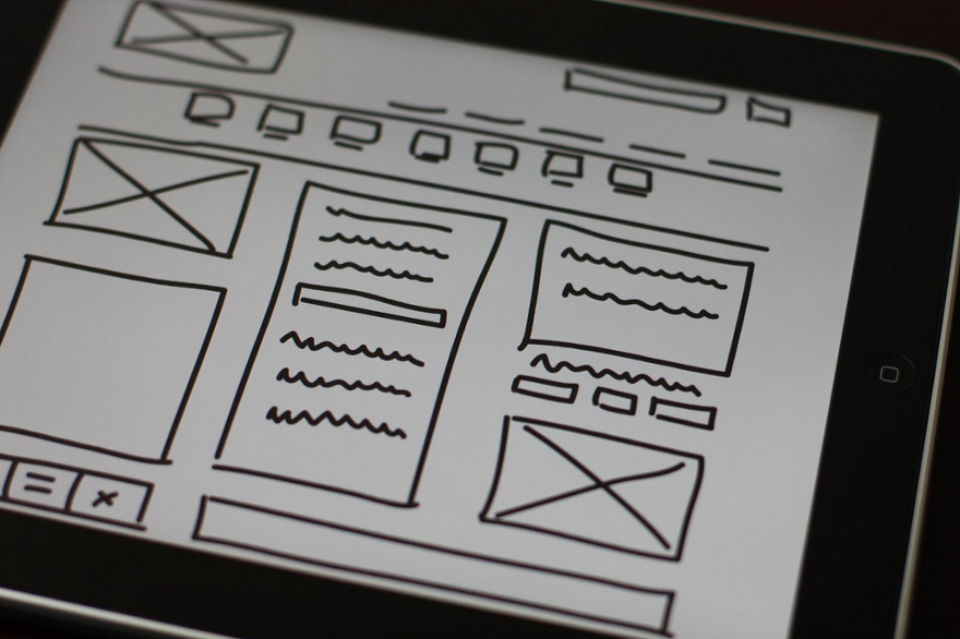
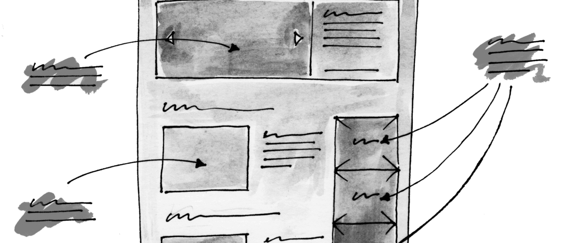
Wireframes are like architectural blueprints for your digital product. They visually represent the overall structure, hierarchy, navigation patterns, and rules for displaying information on your interface. They are a useful tool for drafting an interface before creating a polished prototype, and for documenting functionality details for teammates and clients. Below are our 10 best practices for creating wireframes. (Google, 2023)

Basic UI/UX Design Concept Difference Between Wireframe, Prototype, and Mockup
Wireframe | Mockup | Prototype
The differences of wireframe, prototype, and mockup are always get confused by lots of designers, despite the experienced designer, I saw many people asked questions on Quora and Reddit about these terms, so it's essential to make clear about what the hell is it. That would solve a lot of problems and save energy for designers (Mockplus.com, 2017)

How to Design a Website Prototype from a Wireframe
Figma | UX
You may have heard the old saying: "Measure twice, cut once." Well that is exactly why you should plan out a website before you build it. And that's where prototyping comes in. When we design our websites, we progress from wireframing to prototyping to – finally – a full design. I wanted to explore and expand on what Prototyping actually means by taking you through the full process. (Freecodecamp.org, 2020)

Ontwerpen in scrumprojecten: 3 stappen voor de beste agile aanpak
Design | Proces
Hoe werk je ontwerpen uit bij het ontwikkelen van nieuwe websites en applicaties? Daarmee wordt verschillend omgegaan. In traditionele projecten worden de ontwerpen grotendeels vooraf uitgewerkt en worden er gedurende het project wijzigingen doorgevoerd. Dat is kostbaar, omdat de applicatie dan al deels of helemaal is gebouwd. Het is daarom een goede keuze om het project op basis van scrum aan te pakken (Richard van Mierlo, 2017).


